Company
Greenlight Financial
Industry
FinTech
Timeline
2021 to 2024
My Role
Product Design Lead
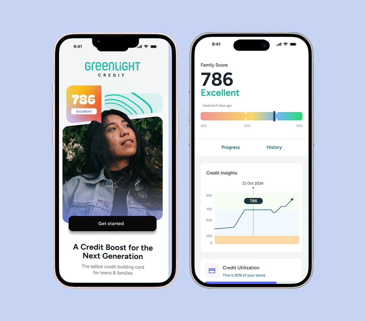
Greenlight Credit
0-to-1 credit product design for a family fintech platform — from banking partner pitches to post-launch iteration
The Project
Greenlight Credit was the company's first-ever credit product, built from zero to launch over three years. I led end-to-end design across the full arc: early ideation, user research, banking partner pitches, compliance reviews, interaction design, and post-launch iteration. I worked directly with a PM, company leadership, and our partner bank, FNBO, and owned every flow from card application through spending controls, authorized user management, and credit coaching.
View Website
30%
of existing Greenlight users applied at launch
42%
of denied applicants engaged with credit coaching
780→750
credit score threshold lowered post-launch by FNBO
The Challenge
Leadership wanted to enter the credit literacy space with a clear mission: help families understand and build credit together, safely. There was no existing product to build on. I joined as lead designer from day one, which meant I was in the room for strategic conversations before a single screen was sketched.
We started by sequencing the work around what product management had scoped first: the authorized user flow and spending limit controls. Those were the features we needed to build, test with users, and run through compliance review with FNBO before anything else could move forward.
Understanding the user
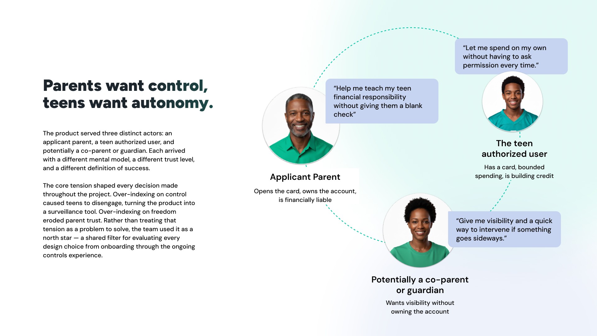
Early in the project I noticed a tension. The product was designed for parents who wanted to help their teens start building credit safely. But through user interviews, a more complicated picture emerged.
Parents — even those with strong credit — had three consistent concerns. They were worried about taking on a new bill. They wanted meaningful control over how their teen used the card. And they wanted to understand exactly how adding an authorized user would affect their own credit score. The underlying sentiment was consistent across interviews: parents understood why building credit as a teen mattered, but they were not willing to put their own credit at risk to do it.
I brought this directly to leadership and our PM. The response was mixed. FNBO, our banking partner, understood the concern and was open to discussing it. Executive leadership wanted to move forward with a premium card experience, closer to an Amex positioning, which did not match what the research was telling us about who would actually apply and why. That tension did not fully resolve before launch.
Design Process
Compliance-First Application Flow
The card application was the most constrained surface in the product. I worked closely with FNBO's compliance team throughout, and the rules were specific: particular language was required around approvals, denials, and payment terms. Certain information could not be requested at certain stages of the application. Disclosures had to appear in defined places. Every word in the application flow went through compliance review before it was final.
This was not a limitation I worked around. It was a design input I worked with. The compliance requirements shaped the information architecture of the application, the sequencing of steps, and the tone of the product from the first screen forward.

Spending Controls – the primary conversion driver
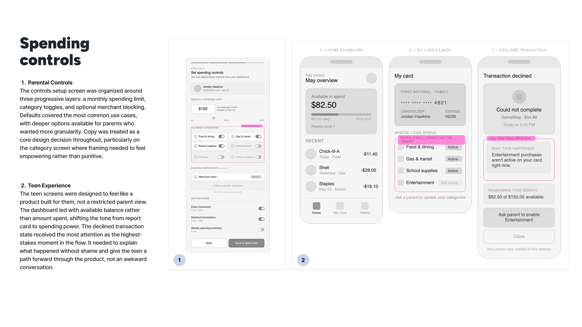
The spending controls flow was where the research directly shaped the design. Parents had told us they wanted to understand exactly how they could manage their teen's use of the card before they would consider applying. We built the controls to be granular and transparent: parents could set a specific spending amount for each family member added to the account, each added member received their own card and their own credit experience, and parents received notifications when a teen was approaching their limit or had a late payment.
The impact was measurable. Once parents saw the controls, they were significantly more likely to move forward with an application. The controls were not just a feature. They were the primary conversion driver.
Credit Coaching and Score Visibility — a post-launch addition
These features were not in the original scope. They came after launch data showed that users below an 800 credit score were consistently less likely to be approved. The approval gap I had flagged in research was now showing up in the numbers.
We designed the credit coaching tool to serve those users: families who wanted to build toward qualifying for the card, or who simply wanted to understand credit better without taking on a new line. I had to navigate an additional layer of constraints here, working through Experian's requirements alongside FNBO's, as the credit monitoring feature pulled from bureau data.
The coaching tool launched to a limited user base initially while FNBO completed their review process for full adoption.

At launch, 30% of current Greenlight users applied for the card. The approval rate came in at 15 to 18%, confirming the barrier to entry the research had pointed to: applicants with a 780 credit score or higher were approved; those below that threshold were frequently denied. The more significant number came from the users who were not approved. Among that group, engagement with the credit coaching and monitoring tool reached 42%. Parents who could not get the card still wanted the financial education experience. That usage rate validated the original research finding and supported the case for investing further in the coaching product. Post-launch, FNBO agreed to lower the minimum score threshold from 780 to 750 with adjusted credit limits, which widened access for a meaningful portion of the applicant pool.