Industry:
B2B/Sass
Company
Experience
Year:
2020
Role:
Visual & UX Design
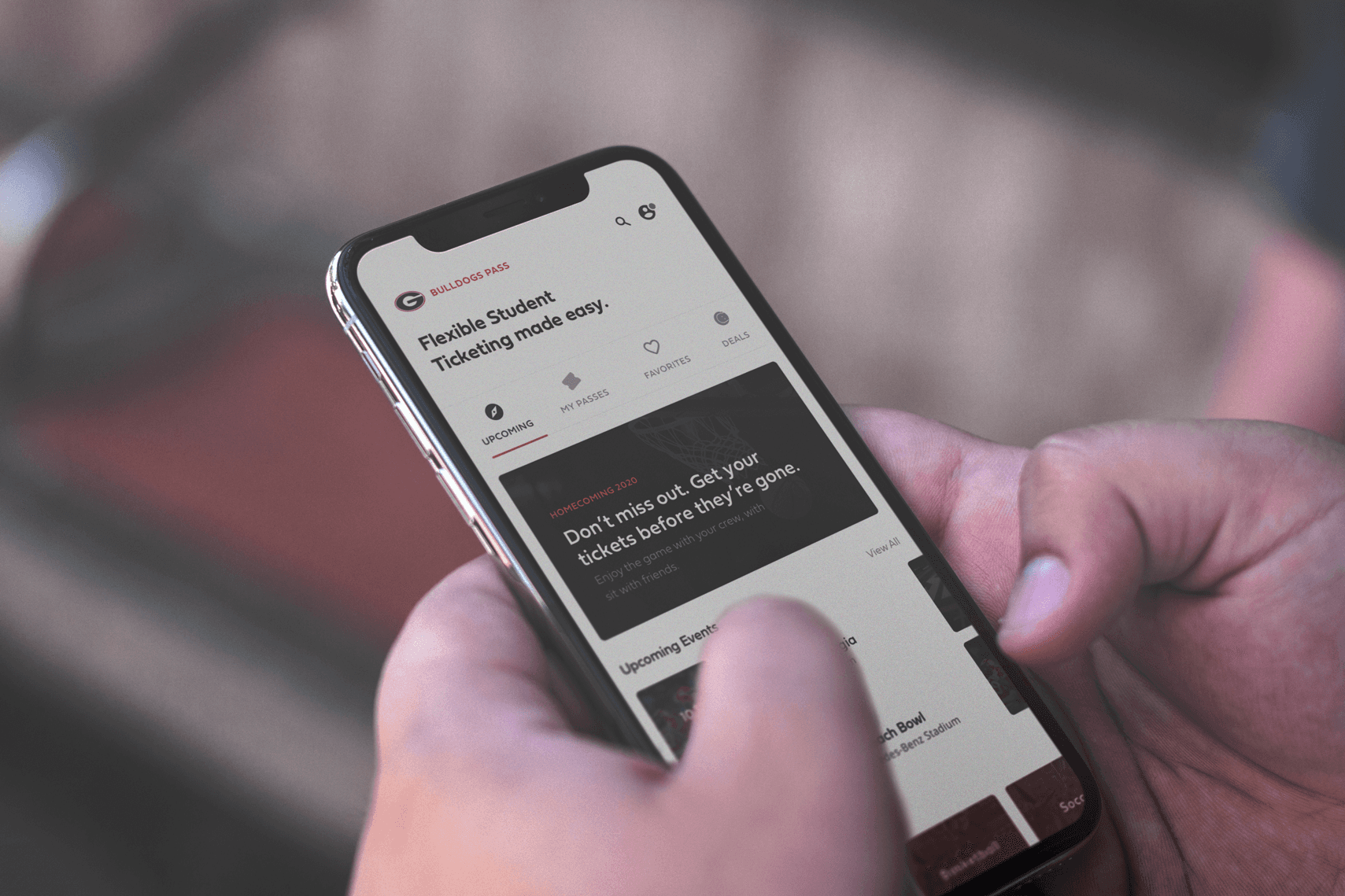
Fan Hub & Partner Portal
The Project
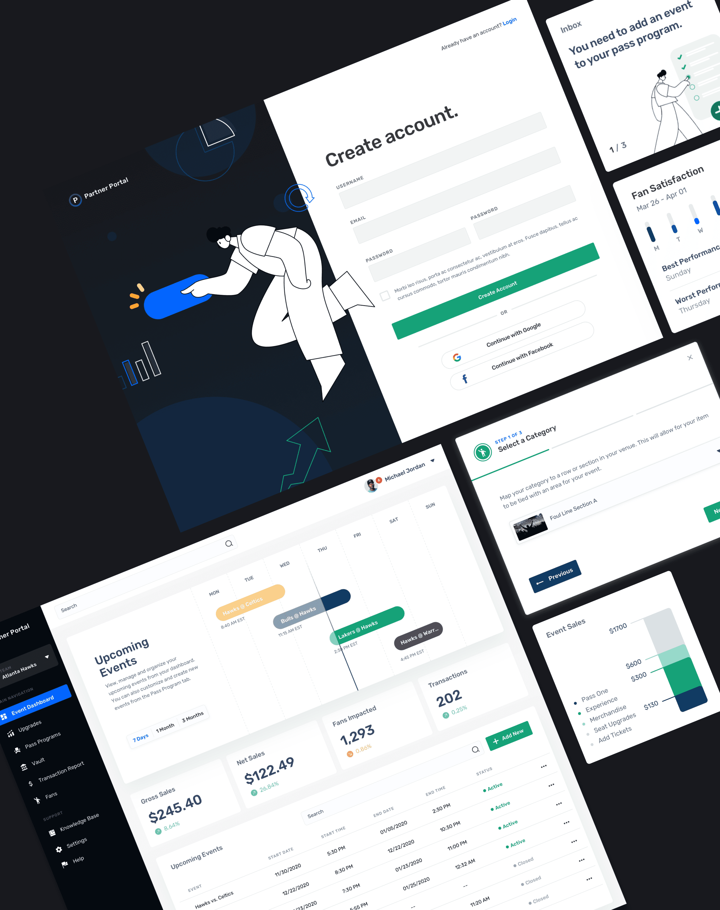
Experience powers ticketing for 200+ sports and entertainment clients across 10,000+ events a year. Partners — stadium ops managers, event coordinators, and venue staff — needed a self-service platform to list, manage, and monitor tickets in real time, often from the floor of a live event. The existing system was a desktop-only tool that couldn't keep pace with how partners actually worked. I led the end-to-end design of the Partner Portal redesign, from discovery through shipped product — partnering with engineering, product, and external Ticketmaster compliance requirements to define the new system.
The Challenge
A 2018 partner survey surfaced that 80% of users needed a more mobile-friendly experience — but the deeper issue was workflow failure. Partners managing live events were trying to create ticket listings, handle fan entry issues, and pull reporting from a slow, inconsistent desktop tool while standing in a stadium concourse between gates. The existing system had no responsive design, inconsistent UI patterns across flows, and no unified framework — every new feature had been bolted on independently. We also needed to meet Ticketmaster's compliance requirements for resale and inventory management, which added complexity to what could otherwise be a simple CRUD flow.
My Process
Discovery
I came onto this project with an existing 2018 partner survey as a starting point. 80% of partners flagged the need for a more mobile-friendly experience, but I needed to understand the depth of the problem before touching a single screen. I partnered with the customer support team to review fan-reported issues and trace them back to their source, supplemented with partner interviews and analytics tracking task completion rates.
What that work surfaced was more systemic than a responsive design problem. The student ticketing flow at university football games became a useful case study in how far upstream the failures actually started. Students without season passes received seats dynamically based on GPS check-in when they arrived at the venue. The fan complaints, app not recognizing their arrival, groups getting split up, confusion about when and how tickets were delivered, were not app bugs. They were the downstream result of partners not having enough configurability on their side to set those events up correctly. The partner tooling was so opaque that event managers could not reliably control how the logic would behave at the gate.
The analytics confirmed the stakes: task completion for fans accessing tickets at entry was the critical metric, and it was meaningfully below where it needed to be for a system running at 10,000+ events a year.
Audit & Technical Alignment
Before any design work could start, I worked directly with the engineering team to audit the existing codebase and UI. The system had accumulated significant technical debt. Previous tech leadership had constrained which features could be improved or shipped, which meant the front end and back end had drifted apart. My role was to flag which interactions were broken, confusing, or needed to be scrapped and rebuilt. Engineering assessed the technical complexity on their side, and we jointly sized and prioritized the work together. The initial audit ran two sprint cycles before we began shipping incremental UX improvements in parallel with the backend migration to a new codebase.
This phase shaped the entire design approach. I recommended adopting Google Material as the UI framework, not as a brand decision, but as a pragmatic one. It aligned most closely with the existing codebase, gave us a proven responsive grid and accessible component library, and let engineering move faster without rebuilding primitives. My preference was a custom design system, but given the timeline and team capacity, Material was the right call for where we were. The intention was always to use it as a foundation we would grow beyond.
Design Exploration & Key Decisions
The two biggest design problems were not visual. They were logic problems that had been paved over with bad UI.
The first was ticket listing transparency. Partners had no clear way to communicate to fans how or when their tickets would be redeemed, so fans showed up at venues without understanding the process. We restructured the ticket listing experience to make that information explicit: when tickets would be issued, how they would be delivered, and what fans needed to do. We also introduced the ability for fans to link their tickets to friends' passes, enabling group seating to be confirmed within 24 hours of the event. This directly addressed the group separation complaints coming through customer support.
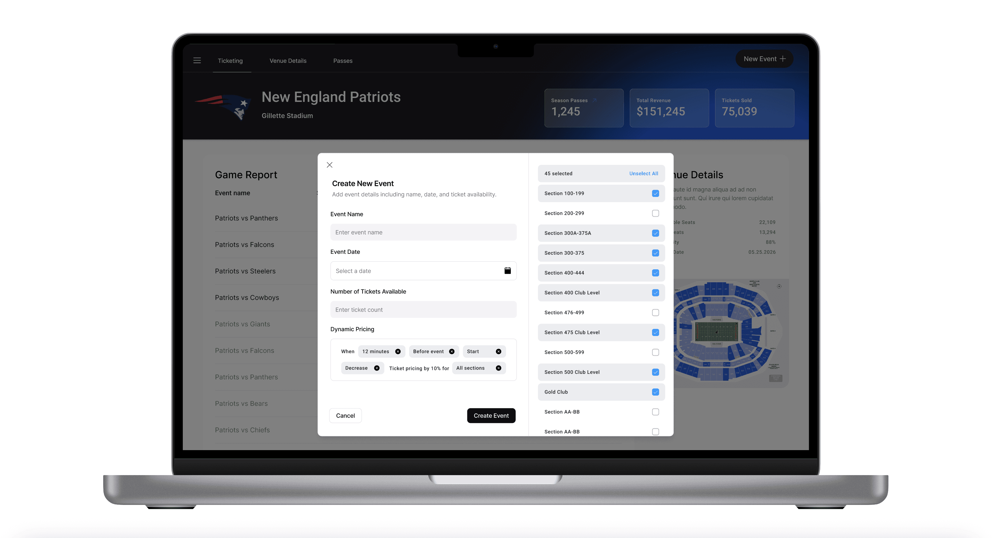
The second, and more significant, was the rules and conditions system. Previously, if ticket prices changed during the week or inventory sat unclaimed before an event, partners had to log into the system mid-event to manually update pricing. That is an unreliable, high-pressure ask. We replaced that workflow with a configurable rules engine: partners could set conditions in advance, and if a certain number of tickets remained unclaimed within a defined window before event start, the system would automatically move that inventory to a lower price tier to drive last-minute sales. Partners set the rules once. The system handled execution. This removed the need to monitor live ticket sales during an event entirely.
Partner Testing
We ran usability testing with partners focused on two core flows: adding a new event to the ticketing system, and configuring rules and conditions. The testing confirmed that the rules interface was the most cognitively demanding part of the new system. Partners understood the concept quickly but needed clearer feedback that their conditions had been saved and would execute as expected. That feedback informed the final version before launch.
The Result
Post-launch, fan-side task completion improved by 42%, measured against the critical flow of accessing tickets at venue entry. The backend redesign and component library also became the foundation for additional product launches across the organization, reducing design-to-development time on subsequent features.