Client
Permitable
Project
Brand & Marketing
Year
2025 to 2026
Role
Lead Visual Designer
Permitable
The Project
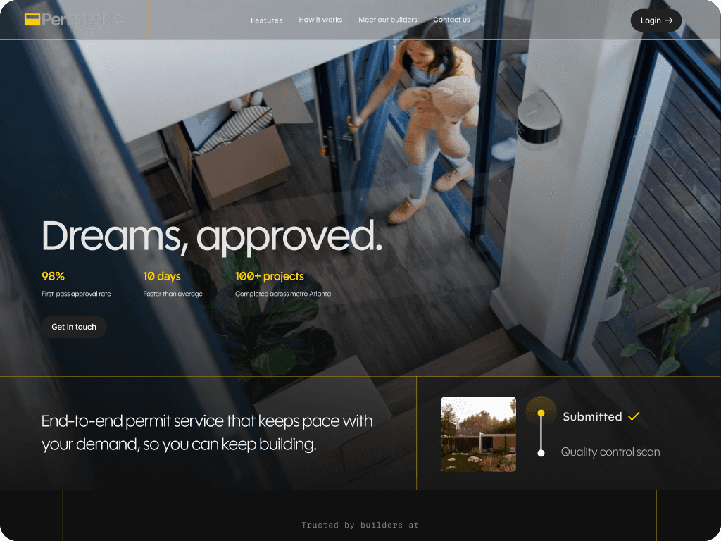
Permitable is a construction permitting SaaS that helps builders navigate the complex, jurisdiction-specific world of building permits. They came to Cherisa Designs and Dynolabs needing to close a credibility gap: a founder-built website that could not support their next chapter, which included active venture funding conversations and a growing builder customer base. I led brand exploration, marketing site design, and pitch deck design for their full go-to-market presence.
View Website
The Challenge
Permitable operates in a genuinely unglamorous space: construction permitting. The brand had to work for two very different audiences at the same time.
Builders checking legitimacy after a sales conversation, deciding whether to trust the product with real projects. And investors evaluating the business for venture funding, looking for signals of scale, repeatability, and real traction.
The existing website was founder-built and undersold the product entirely. It read like an early-stage SaaS tool, not a precision service that luxury residential builders would trust with high-stakes projects. The challenge was creating a brand and site that felt credible and premium without losing the practical, no-nonsense quality that makes builders trust a tool in the first place.
Brand Exploration
I developed two directions and presented both to the client.
The first leaned warmer and more consumer-friendly, closer to the approachable SaaS aesthetic common in productivity tools. It was accessible and legible, but it did not match how modern premium builders think about the services they rely on. Builders at the luxury residential level are accustomed to tools that feel precise and authoritative. A friendly SaaS look signaled the wrong thing.
The second direction, which the client chose, was built around a single idea: The Precision Standard. The reference benchmarks were Rolex, Leica, Rotring, Sub-Zero/Wolf, Pen Type A, and Mnemosyne. Each one was chosen for a specific reason: Rolex for the promise of schedule protection and chronometric accuracy, Leica for engineering purity and understated confidence, Sub-Zero/Wolf for professional-grade stainless with a signature accent color, Rotring for technical heritage and line-weight discipline. The through-line across all of them was precision as a form of luxury, not price as a form of luxury.
The color system that came out of that direction: Steel Base and Steel Shadow as the dominant neutrals, Deep Drafting Navy for authority and hierarchy, Blueprint Grid for technical credibility at low opacity, and Signal Yellow capped at 5% as a single precision cue per view. The constraint on Signal Yellow was intentional. One focal highlight per frame, used only for CTAs, status indicators, and hover states. The moment it appears more than once, the precision read breaks down.
Typography: Degular Medium for headlines, a modern humanist sans with tabular lining numerals for body and data. The numeral choice was specific to Permitable's use case — permit timelines, approval rates, and city-by-city data need to sit in columns without shifting width.
Marketing Site & Pitch Deck
I structured the site to serve both audiences without splitting into two separate experiences. Builders lead. The first thing a builder sees after a sales conversation is a clear articulation of what Permitable does and what it saves them: time on permit submission, tracking, and approval. Investor-relevant signals, team, market size, traction, and the city-launch model, are present throughout but not dominant. They read as proof points for a builder evaluating legitimacy, and as traction signals for an investor doing diligence. The same content does both jobs because the framing is right.
Multi-city presence was a deliberate signal on both sides. For builders, it communicated that the product works across jurisdictions, not just one local market. For investors, it communicated a repeatable expansion model and a key indicator of scalable TAM.
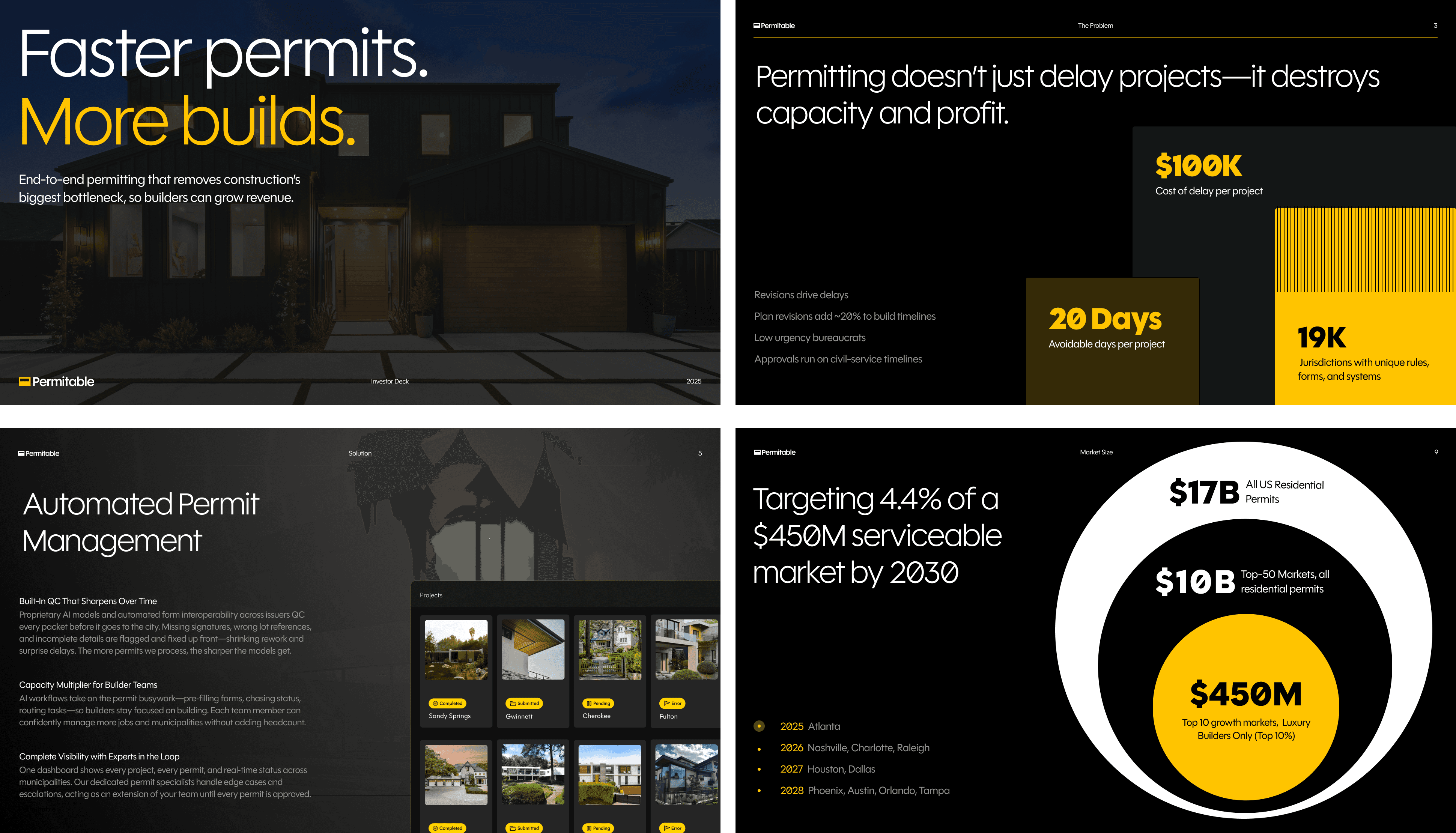
The pitch deck required a similar reframe. The original deck led with a product walkthrough, showing how Permitable works before explaining why the market needed it. For an investor audience that is the wrong sequence. Features are not the argument. The problem size and the repeatability of the solution are the argument. I restructured the narrative to lead with market size and the core inefficiency in construction permitting, then position Permitable as a precision solution to a measurable problem, then use the product demo as proof of the outcome claim rather than as the pitch itself. The demo was reframed around outcomes: how much time Permitable saves builders on permit submission, tracking, and approval. Specific numbers, not feature descriptions.